SVG progress indicator in react native - Part 1
Building the base

| 📚 Part 1: Building the base | 👈 you are here |
| 🧱 Part 2: Building the component | |
| ✨ Part 3: Adding refinements and animation |
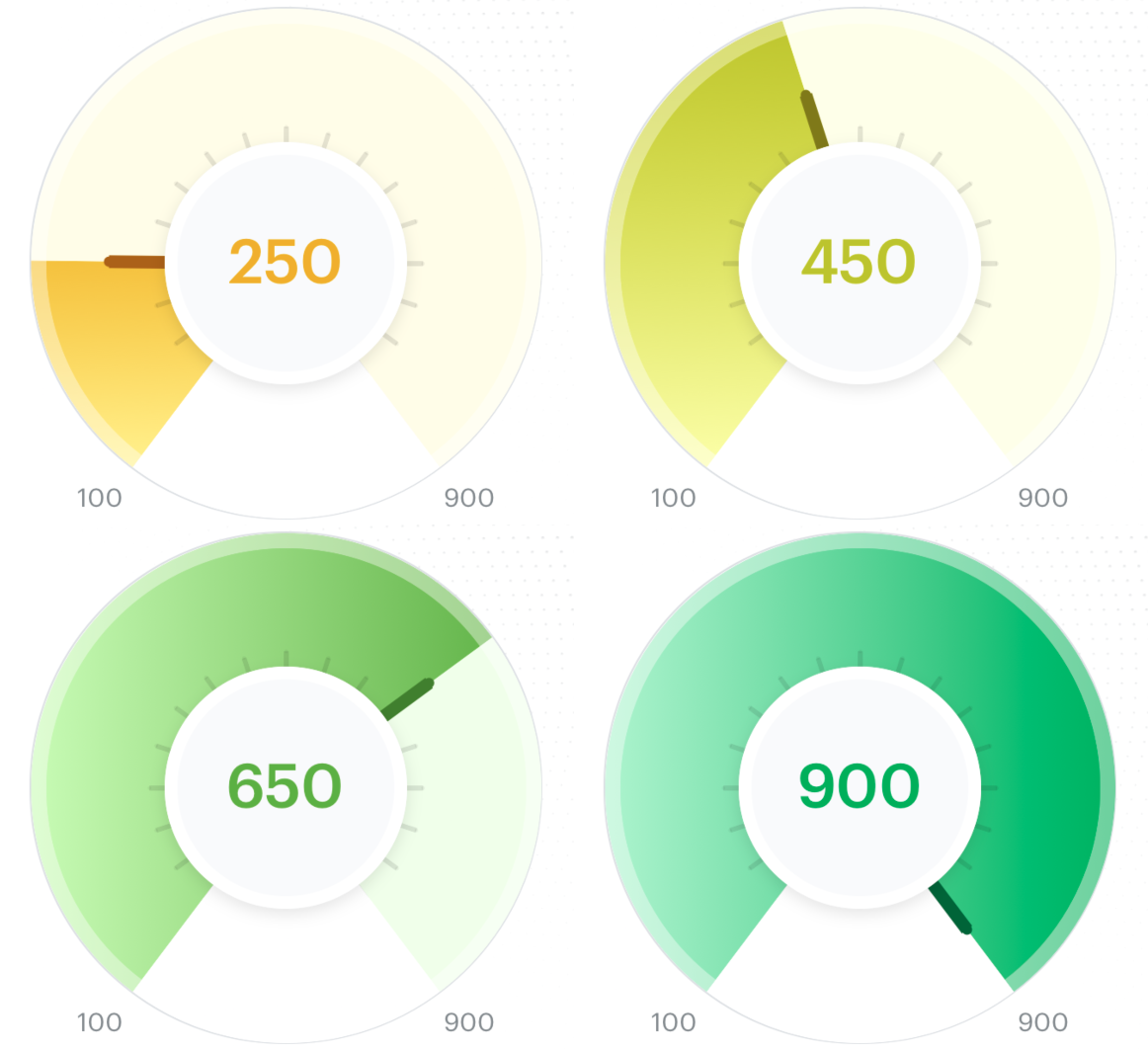
One of the things I enjoy the most in frontend development is creating beautiful components with animations✨ and that is what I got to work on in a recent project @smallcase where I created this beautiful gradient score indicator. In this 3-part series of blogs, we will go step by step on how to create a similar component.
The first part focuses on going through the basics required to build the above component and then creating the base component. Let's dive in!
Third-party packages used
We will be using only a single third-party package called react-native-svg which will help us create complex shapes like the progress arc, indicator needle, or any other shape we want using SVG.
Component breakdown
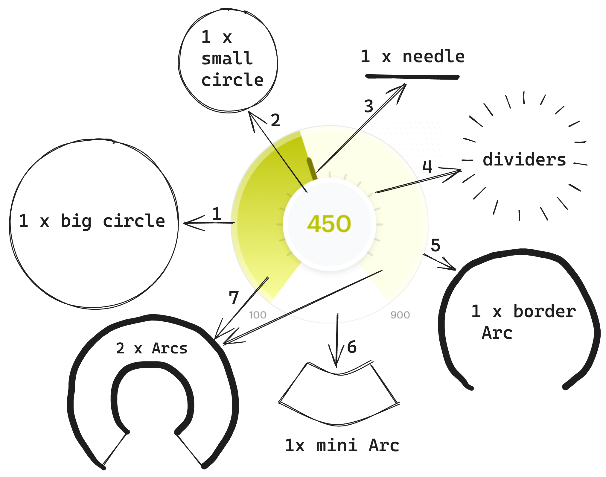
After taking a look at the component I will divide it into the following parts:
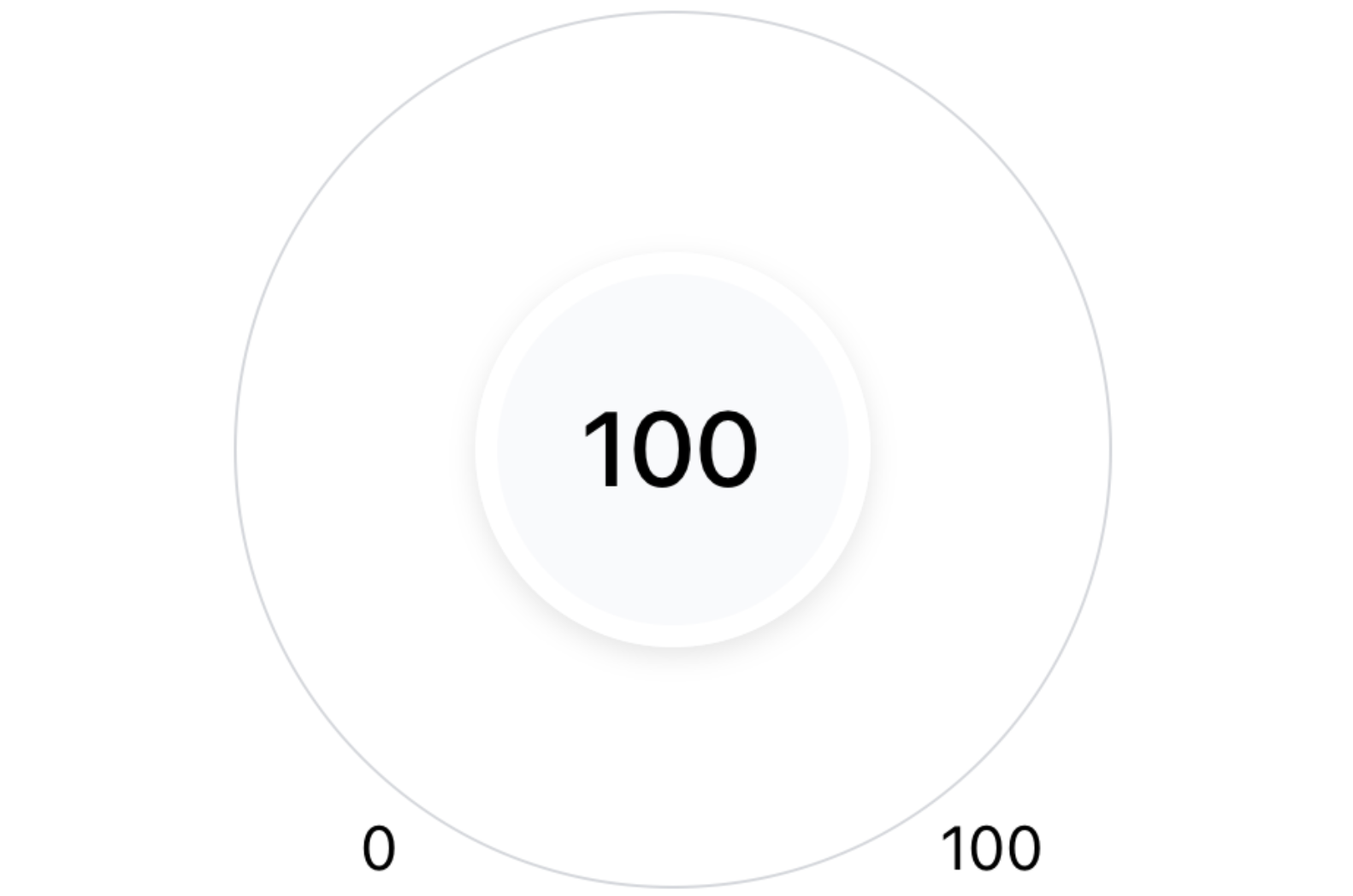
Background white circle - The whole component has the shape of a circle and we will build this on top of this circle which will act as the base layer. Outside the circle:
at the bottom left, we will display the minimum progress (100 in the image above)
at the bottom right, we will display the maximum progress (900 in the image above)
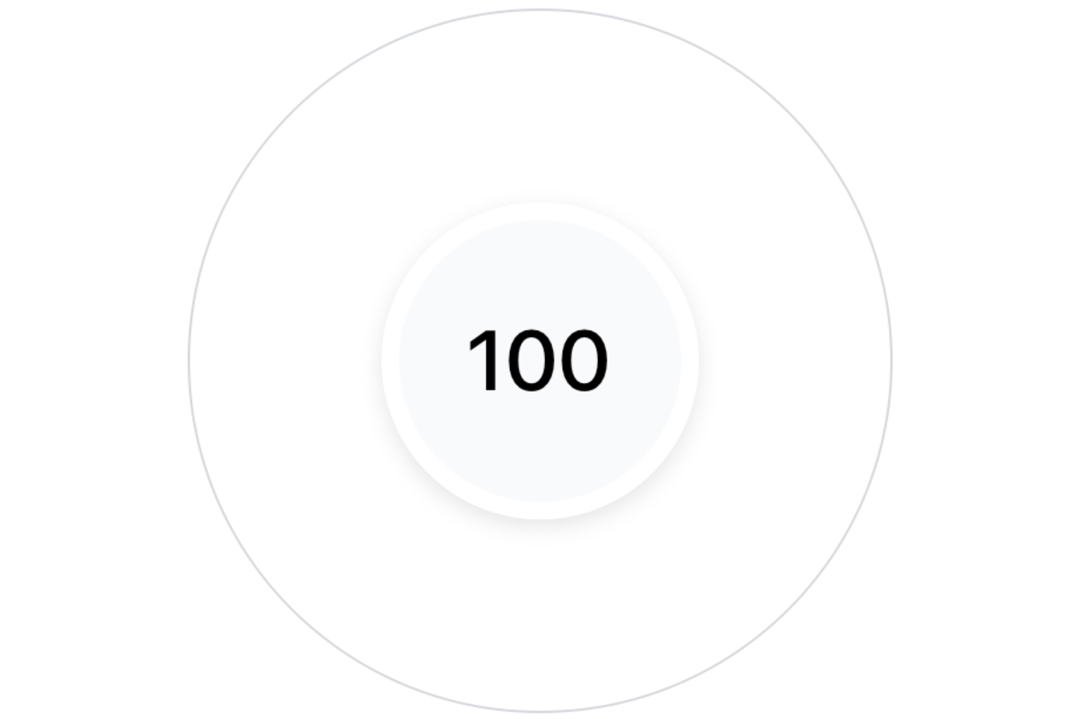
Center circle - This circle will be used to display the actual progress of the user.
Current progress needle - A needle component that will point to the user's current progress on the indicator.
Dividers around the center circle - We can see in the above image the progress starts from 100 and ends at 900. These dividers will indicate score values between the min and the max progress.
Border transparent arc - We have one more arc on the borders of the indicator which will be a transparent arc.
Mini-white Arc - We will use this arc to hide the bottom dividers on the progress indicator. More on this later.
Background Arc and the Gradient Arc - On top of the circle we have 1 arc which starts from 100 and goes to 900 and will act as the base of the indicator. Then we will have another arc on top of this arc which we will call the gradient arc that will be used to indicate the user's current progress.
Now before we start creating the above component let's refresh some math basics around circle and arc.
Some Math Magic
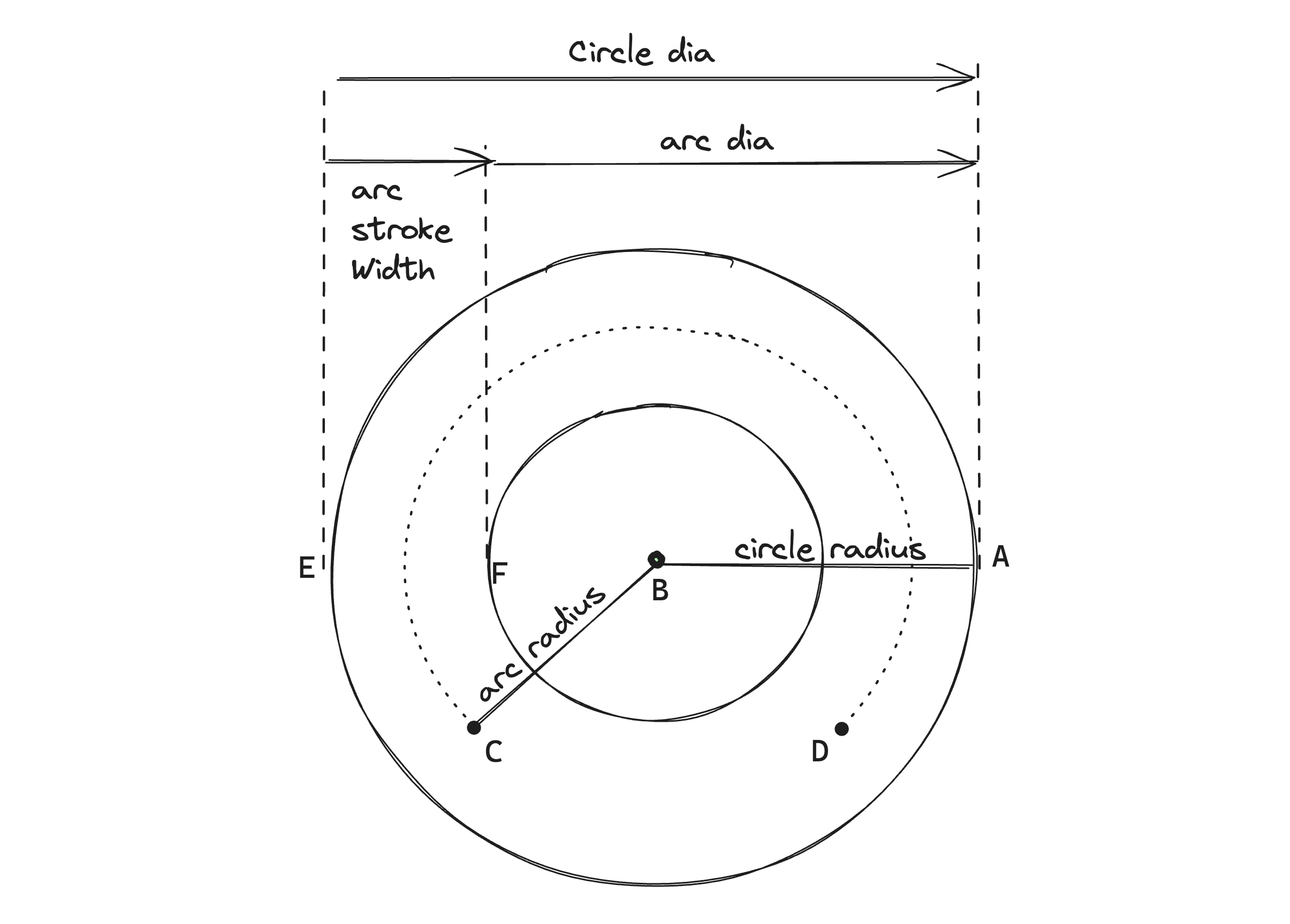
In the above diagram we can see the following:
The width of the circle i.e., the distance from point E to point A is called the diameter of the circle, and just half of this distance i.e. from point B to any point on the circle like point A is called the radius of the circle. In our component's context, this will be the radius of the white background circle/outer circle.
An arc is a portion of the circle and lies on its circumference. Point C to Point D represents an arc on the dotted circle.
- The line from Point B to C represents the radius of the dotted circle which is also the radius of the arc CD.
The distance between point E to point F is the stroke width of the arc which represents the thickness of the line used to outline our arc.
In our component's context using the arc radius, we will be drawing an arc of thickness = stroke width which will be used to create the gradient and the background arcs.
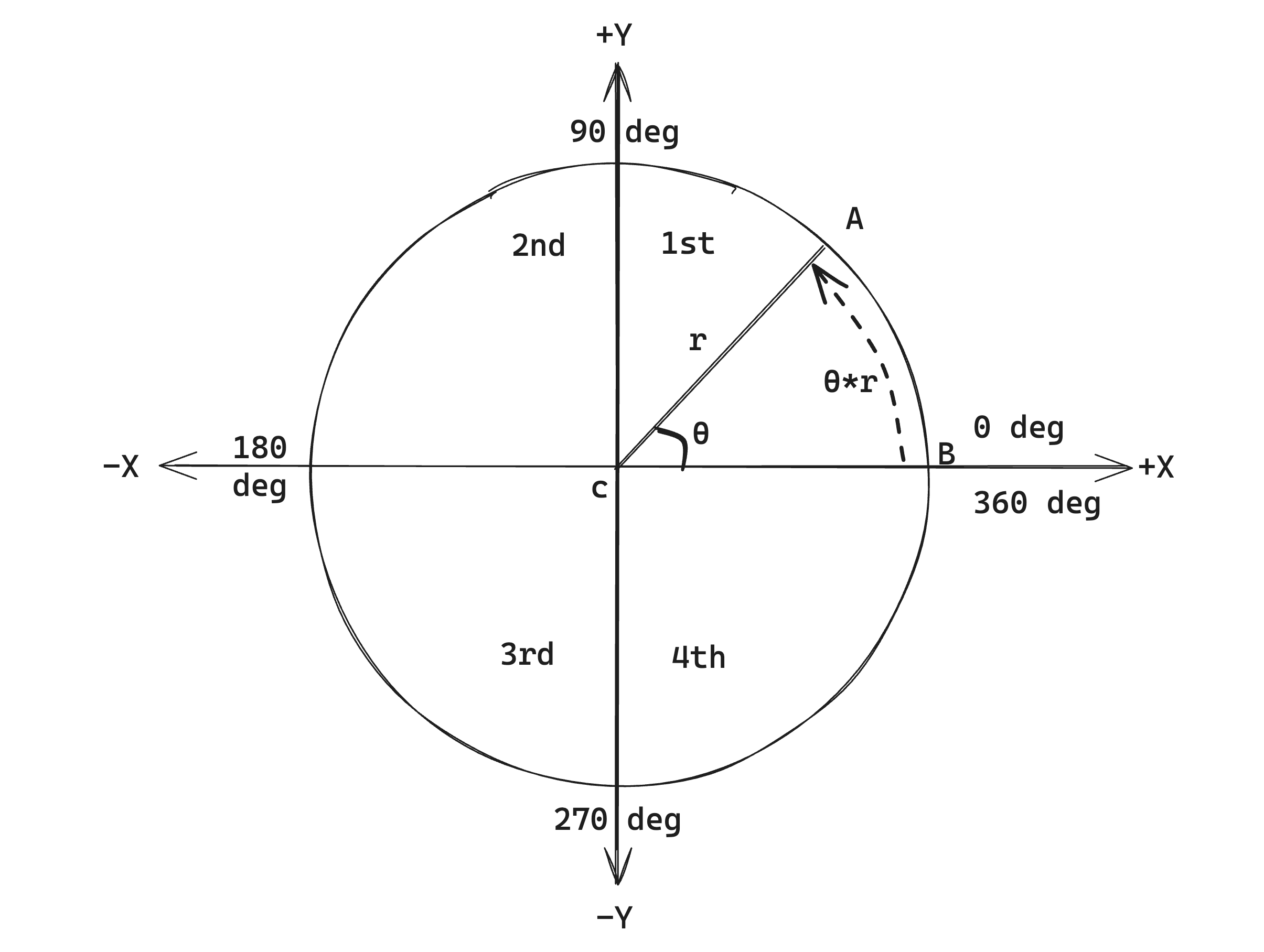
Now let's talk about how angles work in a circle using the above diagram:
The circle starts from Point B and if you start from Point B and go anti-clockwise to reach Point B again the 1 full revolution is 360 deg or $2π$radians.
To find the length of the same revolution (also called the circumference) we can use the formula $2π×r$ where $r$ is the circle's radius.
To find the length of an arc, which is point B to A here we can use the formula $ϴ × r$ where $ϴ$ is the angle created by the start and end point of the arc with the center of the circle in radians, which is angle ACB here.
Given an angle, if you want to find the X and Y coordinates of the point on the circle we can use the formula \(x=rcosθ\) and \(y = r sinθ\) and based on which quadrant we are the sign for cos and sin changes (assuming the center of the circle i.e Point $x$ is at [$x$ = 0, $y$ = 0]):
| Quadrant | Angle range | sin | cos |
| 1st | 0 to 90deg | positive | positive |
| 2nd | 90 to 180deg | positive | negative |
| 3rd | 180 to 270deg | negative | negative |
| 4th | 270 to 360deg | negative | positive |
The SVG coordinate system
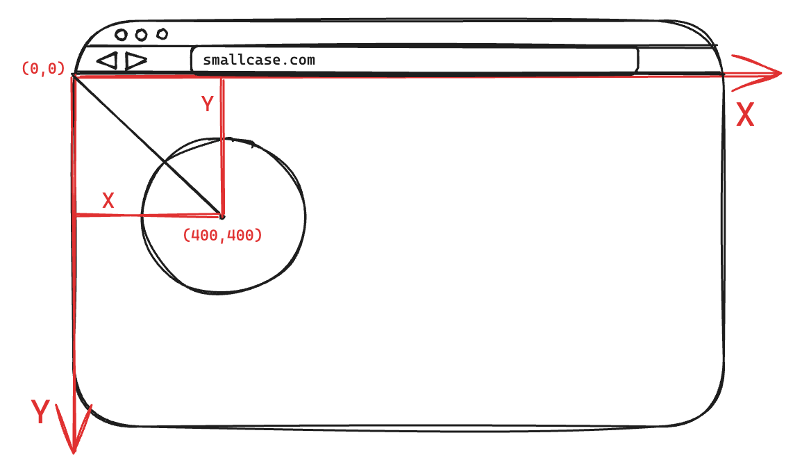
In the world of SVG, the top left-most corner of the SVG canvas is considered as the point (0, 0). In the above diagram, we have an SVG canvas of the same height and width as that of the screen (the box with the black borders), which means the whole screen comes under the 4th quadrant (row 4th in the previous section). So if we want to find any coordinate of a circle here the formula will be:
\(x=rcosθ\)
\(y = -r sinθ\) (as in the 4th quadrant only cos is positive)
Another interesting thing to note is that in digital systems the coordinate system is inverted in comparison to the Cartesian/Rectangular Coordinate system that we use in mathematics. Because of this even though the Y axis points downwards, in the SVG coordinate system it is considered as positive.
- Example: when y = 400 (positive) in the above diagram the circle got drawn at a distance of 400 in the downward direction
Now using the above info, let's get started with the component creation.
Component Creation
Let's start with creating our Progress Indicator component which accepts the following 3 props:
currentProgress - denotes the current progress of the user
maxProgress - denotes the maximum progress value that can be possible.
minProgress - denotes the minimum progress value that can be possible. (Useful in cases where consumers want to start the progress for some X number instead of 0)
const GradientArcProgressIndicator = (props) => {
  const { currentProgress, maxProgress = 100, minProgress = 0 } = props;

  return <></>;
};
The base and center circle
First, we will create the base circle which will be just an <Svg> element wrapped by a <View /> container which is responsible for styling the container.
const OUTER_CIRCLE_WIDTH = 200;
const OUTER_CIRCLE_BORDER_WIDTH = 0.5;
const OUTER_CIRCLE_BORDER_SPACE_DIA = OUTER_CIRCLE_BORDER_WIDTH * 2;

const GradientArcProgressIndicator = (props) => {
  const { currentProgress, maxProgress = 100, minProgress = 0 } = props;
  return (
     <View style={styles.container}>
      <Svg style={styles.svgContainer}>
        {/**
         * Work in progress
         */}
      </Svg>
    </View>
  );
};

const styles = StyleSheet.create({
  container: {
    height: OUTER_CIRCLE_WIDTH + OUTER_CIRCLE_BORDER_SPACE_DIA,
    width: OUTER_CIRCLE_WIDTH + OUTER_CIRCLE_BORDER_SPACE_DIA,
    justifyContent: 'center',
    alignItems: 'center',
    borderWidth: OUTER_CIRCLE_BORDER_WIDTH,
    borderRadius: 100,
    borderColor: '#D4D7DC',
  },
  svgContainer: {
    width: '100%',
    height: '100%',
  },
});
Next, we will create the center circle. This container will act as the place where we will display the user's current progress.
const OUTER_CIRCLE_WIDTH = 200;
// percentage of the outerCircleWidth we want our stroke width to be
const ARC_STOKE_WIDTH_PERCENTAGE = 0.275;
// distance b/w the outer circle and inner circle
const ARC_STROKE_WIDTH = OUTER_CIRCLE_WIDTH * ARC_STOKE_WIDTH_PERCENTAGE;
const INNER_CIRCLE_WIDTH = OUTER_CIRCLE_WIDTH - (2 * ARC_STROKE_WIDTH);

const GradientArcProgressIndicator = (props) => {
  const { currentProgress, maxProgress = 100, minProgress = 0 } = props;
  return (
    <View style={styles.container}>
      <Svg style={styles.svgContainer}>
        {/**
         * Work in progress
         */}
      </Svg>

      // inner circle
      <View style={styles.centerCircle}>
        <Text>{currentProgress ?? '—'}</Text>
      </View>
    </View>
  );
};

const styles = StyleSheet.create({
  // other styles
  ...,
  centerCircle: {
    position: 'absolute',
    height: INNER_CIRCLE_WIDTH,
    width: INNER_CIRCLE_WIDTH,
    borderRadius: 100,
    backgroundColor: '#f9fafc',
    borderWidth: 5,
    borderColor: '#fff',
    justifyContent: 'center',
    alignItems: 'center',
    // shadow on iOS
    shadowOffset: { width: 0, height: 2 },
    shadowOpacity: 0.1,
    shadowColor: '#000',
    // shadow on android
    elevation: 2,
  },
});
Now let's add the max and min score text on our indicator:
const GradientArcProgressIndicator = (props) => {
  const { currentProgress, maxProgress = 100, minProgress = 0 } = props;
  return (
    <View style={styles.container}>
      <Svg style={styles.svgContainer}>
        {/**
         * Work in progress
         */}
      </Svg>

      // max and min score
      <View style={styles.minMaxProgressContainer}>
        <View style={styles.minProgressTextContainer}>
          <Text>{minProgress}</Text>
        </View>
        <View style={styles.maxProgressTextContainer}>
          <Text>{maxProgress}</Text>
        </View>
      </View>

      // inner circle
      <View style={styles.centerCircle}>
        <Text>{currentProgress ?? '—'}</Text>
      </View>
    </View>
  );
};

const styles = StyleSheet.create({
  // other styles
  ...,
  minMaxProgressContainer: {
    position: 'absolute',
    bottom: 0,
    width: '100%',
    flexDirection: 'row',
    justifyContent: 'space-between',
  },
  minProgressTextContainer: {
    left: 28,
  },
  maxProgressTextContainer: {
    right: 15,
  },
});
Final output:
The Arcs
To draw an arc using SVG we need to use the <Path /> element. The path element has an attribute d that accepts a set of drawing commands to create complex shapes and we will be using the same for drawing an Arc.
<Path
  d=`M ${arcStartX} ${arcStartY} A ${arcRadius} ${arcRadius} ${xAxisRotation} ${largeArcFlag} ${sweepFlag} ${arcEndX} ${arcEndY}`
  fill="none"
  stroke=""
  strokeWidth=""
/>

Let's understand these sets of commands one by one.
To make it easier to understand, you can imagine there is a pen to which you need to give commands to draw a shape on a canvas (here the canvas being the screen).
The first command we give our pen is Move to -
M arcStartX arcStartYwhich as the name says means to move the pen to a location (x,y) on the canvas. This is where we want to start drawing our shape from.The next command is the A command used to draw the arc. This command accepts a lot of parameters because given two points there can be 2 different ellipses/circles that can be drawn through them and along either of the circles there can be two possible paths we can draw to connect them and all these parameters help us to configure that.
In the above figure, the green and blue circles are the two possible ellipses and inside the blue circle, the path along the shaded and the unshaded region are the two possible paths that can be taken.
The first two parameters the A commands accept are the x and y radius of the ellipses. In our case, the ellipse will be a circle so the x and y radius will be the same -
A ${arcRadius} ${arcRadius}The next parameter is the x-axis-rotation which is used for rotating the arc.
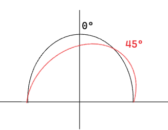
In the above figure, the black arc has the x-axis rotation set to 0 degrees and when we change it to 45 degrees the arc rotates to the right which is represented by the red circle.
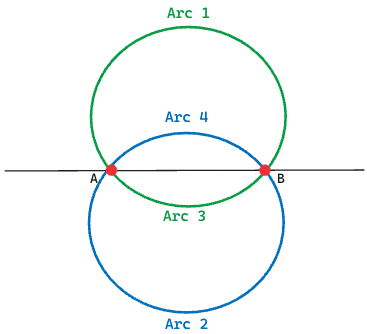
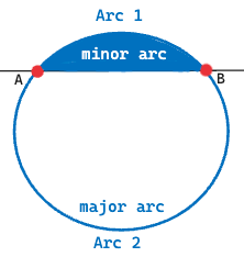
The next parameter is the large-arc-flag which is used to select the major (arc greater than 180 degrees) or the minor arc (arc less than 180 degrees) that can be drawn between the two points. In the example below, the path along the unshaded area is the major arc, and along the shaded area is the minor arc.
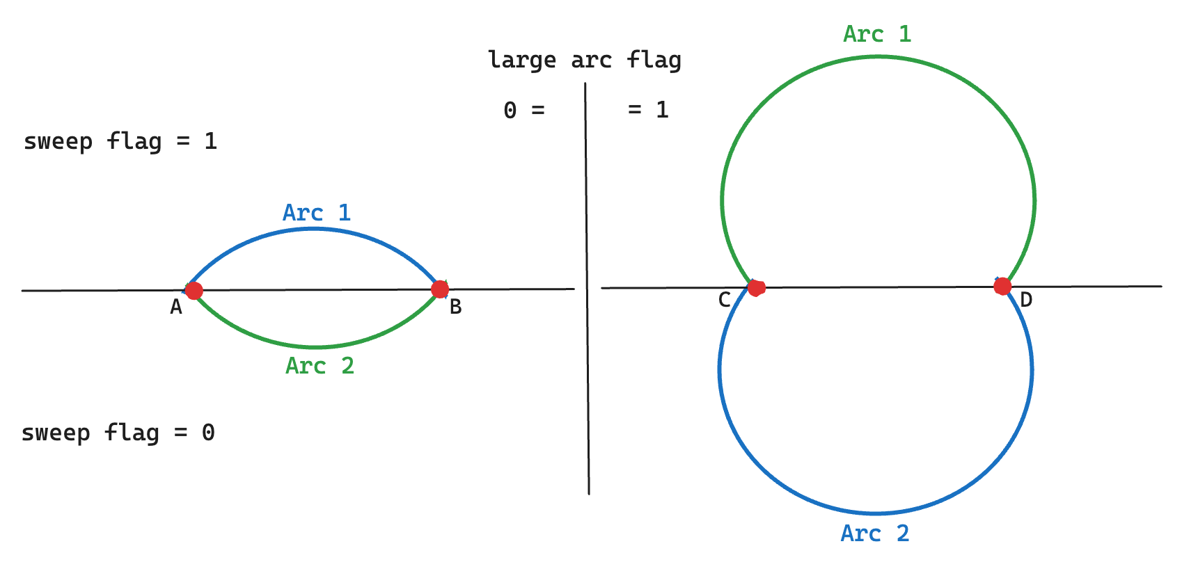
The sweep-flag parameter is used to determine in which direction the arc should be drawn which can be either negative (clockwise) when set to 0 or positive (counterclockwise) when set to 1. In the below diagram, Arc 1 represents the arcs moving toward positive angles and Arc 2 represents the arcs moving toward negative angles. When combined with the large arc flag we will get all 4 possible arcs:
The last two parameters are the x and y coordinates of the point where the arc should end.
Continued in the next part
Now that we have all the necessary knowledge and our base component ready, in the next blog, we will start creating the core components of our progress indicator.
Head over to the next part: