SVG progress indicator in react native - Part 3
Adding refinements and animation
| 📚 Part 1: Building the base | |
| 🧱 Part 2: Building the component | |
| ✨ Part 3: Adding refinements and animation | 👈 you are here |
Welcome back! This is the last part of the 3-part blog series and in this part, we'll enhance our existing component and add some exciting animations to bring it to life. Let's get started!

The Dividers
We will create a new component called as ProgressDividers which will render a set of radial dividers in the middle of our progress indicator. This will make our indicator more intuitive and user-friendly.
The component will accept 3 props:
circleCenterX and circleCenterY - This will be the starting position for drawing the divider lines i.e. the circle center.
circleWidth - The width of the progress indicator outer circle. We will use this to calculate the length of the divider.
const DividerConfig = {
  COUNT: 20,
  // divider length in terms of circle radius
  DIVIDER_TO_RADIUS_RATIO: 0.5,
  WIDTH: 2,
  TOP_CIRCLE_RADIUS: 0.7,
};
// full circle = (2 * Math.PI)
const ANGLE_BETWEEN_TWO_DIVIDERS = (2 * Math.PI) / DIVIDER_COUNT;

const ProgressDividers = ({
  circleCenterX,
  circleCenterY,
  circleWidth,
}: GetSvgScoreDividers): JSX.Element[] => {
  const dividers = [];
  const circleRadius = circleWidth / 2;
  const dividerLength = circleRadius * DividerConfig.DIVIDER_TO_RADIUS_RATIO;

  // return DividerConfig.COUNT number of dividers
  for (
    let dividerNumber = 0;
    dividerNumber < DividerConfig.COUNT;
    dividerNumber++
  ) {
    // start with the smallest angle and go till 360 degree
    const currentSectionAngle = dividerNumber * ANGLE_BETWEEN_TWO_DIVIDERS;
     // find the end coordinated of divider
    const [dividerEndX, dividerEndY] = getArcCoordinates({
      angle: currentSectionAngle,
      radius: dividerLength,
      circleCenterX,
      circleCenterY,
    });

    dividers.push(
      <React.Fragment key={`score-divider-${dividerNumber}`}>
        <Line
          x1={circleCenterX}
          y1={circleCenterY}
          x2={dividerEndX}
          y2={dividerEndY}
          stroke={`${ColorConfig.shadowColor}1a`}
          strokeWidth={DividerConfig.WIDTH}
        />
        <Circle
          fill={`${ColorConfig.shadowColor}0d`}
          r={DividerConfig.TOP_CIRCLE_RADIUS}
          cx={dividerEndX}
          cy={dividerEndY}
        />
      </React.Fragment>,
    );
  }

  return dividers;
};
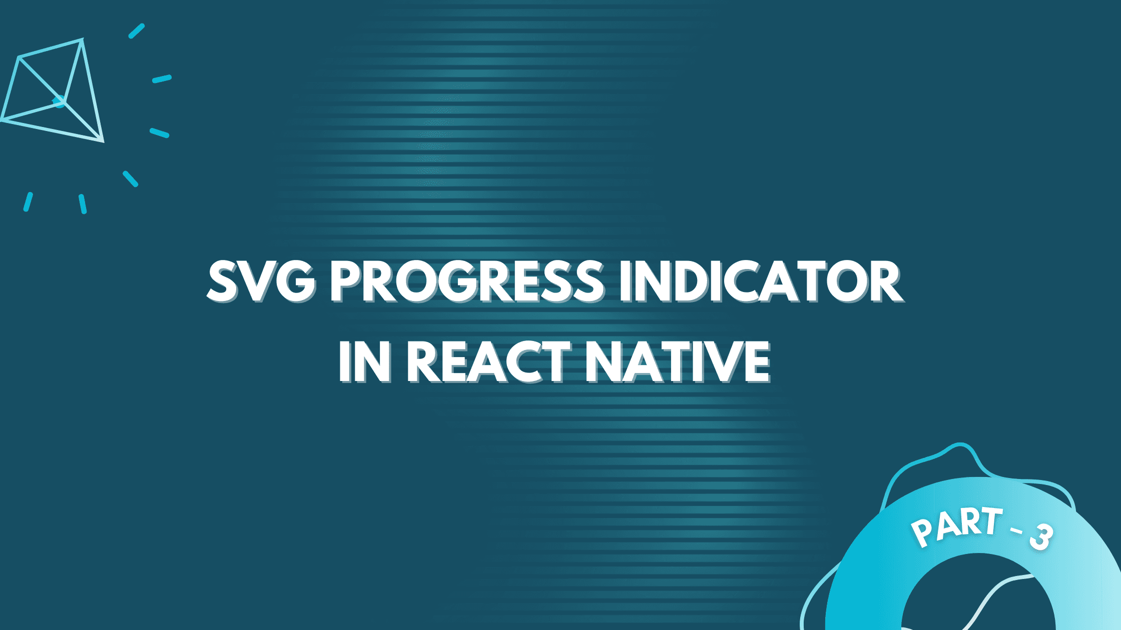
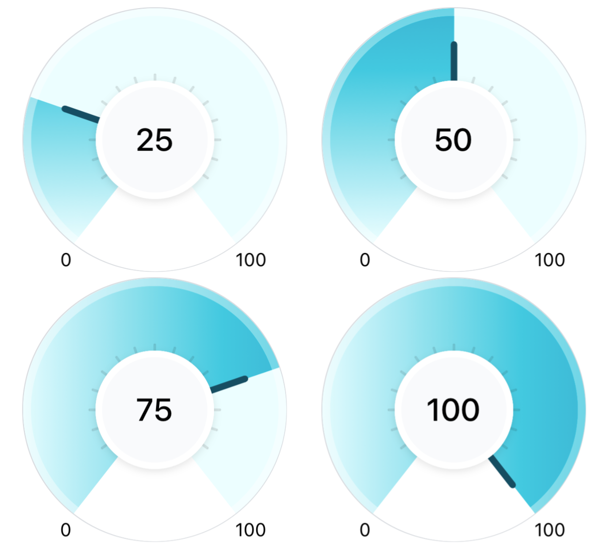
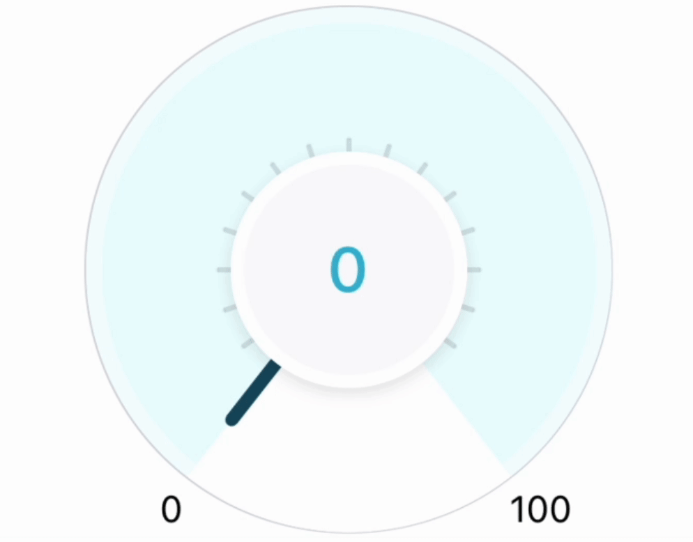
The creation of the divider is very similar to that of the needle, just that instead of a single needle we created a component that returns 20 dividers in a radial pattern. The component draws dividers evenly around the circular indicator, starting from 0 to 360 degrees, with consistent angular intervals. Now add the same to our main component:
const GradientArcProgressIndicator = (props) => {
  const { currentProgress, minProgress = 0, maxProgress = 100 } = props;
  const {
    ...,
    circleCenterX,
    circleCenterY,
  } = getArcData({ ...expected params });

  return (
    <View style={styles.container}>
      <Svg style={styles.svgContainer}>
        {... // rest of the code}

        {/** transparent border arc */}
         ...

        {/** dividers */}
        <ProgressDividers
          circleCenterX={circleCenterX}
          circleCenterY={circleCenterY}
          circleWidth={OUTER_CIRCLE_WIDTH}
        />

        {/* Needle */}
         ...
      </Svg>
        {... // rest of the code}
    </View>
  );
};
that gives us:
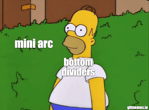
The Mini arc
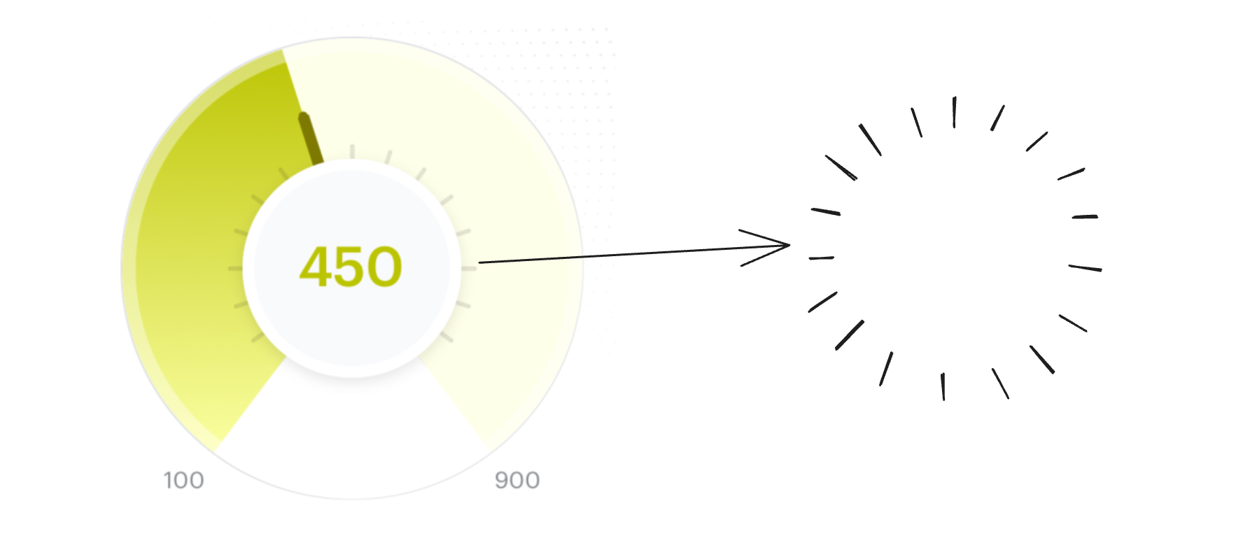
Now to complete our component, let's create the final piece, the mini arc. This arc will be used to hide the dividers that are shown outside the range (0-100) of our progress indicator.
To create this:
We will use the large arc flag which is one of the flags that is used for creating an arc using the
<Path />SVG element.We already have calculated the path for the arcs used by the background and the gradient arcs in the previous steps which is the path for the major arc.
To create the mini-arc we need to create the minor arc part of the same circle
  const getArcData = (params) => {
  // ... already explaing code here

  const largeArcFlag = 1; // create the major arc
  const sweepFlag = 1; // drawn arc counterclockwise (positive direction).
  const indicatorArcPath = `M ${arcStartX} ${arcStartY} A ${arcRadius} ${arcRadius} 0 ${largeArcFlag} ${sweepFlag} ${arcEndX} ${arcEndY}`;
  // same as indicatorArcPath just a change in largeArcFlag from 1 to 0
  const dividerCoverArcPath = `M ${arcEndX} ${arcEndY} A ${arcRadius} ${arcRadius} 0 0 ${sweepFlag} ${arcStartX} ${arcStartY}`;

  return {
    pathsData: {
      indicatorArcPath,
    },
  };
}

const GradientArcProgressIndicator = (props) => {
  const { currentProgress, minProgress = 0, maxProgress = 100 } = props;
  const {
    ...,
    pathsData,
  } = getArcData({ ...expected params });

  return (
    <View style={styles.container}>
      <Svg style={styles.svgContainer}>
        {... // rest of the code}

        {/** dividers */}
        ...

       {/** arc to cover extra dividers */}
        <Path
          stroke="white"
          fill="none"
          d={pathsData.dividerCoverArcPath}
          strokeWidth={ARC_STROKE_WIDTH}
        />

        {/* Needle */}
         ...
      </Svg>
        {... // rest of the code}
    </View>
  );
};
In the code above we just changed 1 flag in the already-created indicator arc path (indicatorArcPath) which is the large arc flag from 1 to 0 which gave us the minor arc we wanted (The dividers at the bottom got overlapped by our mini-arc):
Adding animation

Let's add some animation to make the indicator look more interesting. We will be animating the following components related to current progress:
The current progress text is shown at the center of the indicator.
Gradient arc that indicates current progress
Progress indicator needle
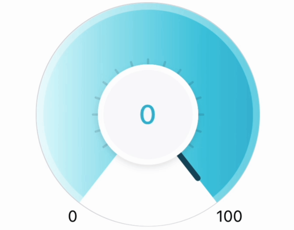
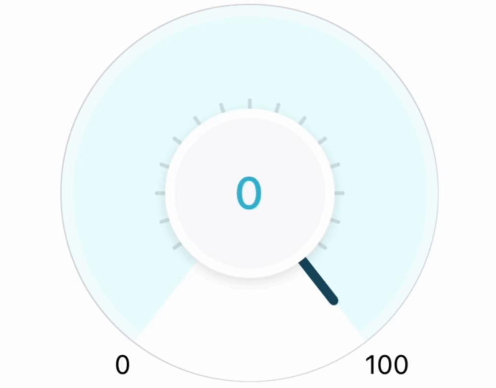
Which gives the following result:
Current progress text
Let's create a component that shows a count-up animation i.e. from minProgress to currentProgress it will show numbers going up. This component will accept three props:
countFrom - Initial count value from where the animation will start.
countTo - Final count value where the animation will stop/
duration - time taken in milliseconds to animate from
countTotocountFrom
import { Animated, Text } from 'react-native';

const CountUpAnimatorText = ({ duration, countFrom, countTo }) => {
  // Step 1 - Declare initial variables
  const animatedValue = useRef(new Animated.Value(countFrom)).current;
  const [animatedCount, setAnimatedCount] = useState(countFrom.toString());

  // Step 2 - Start the animation
  useEffect(() => {
    // animate ${animatedValue} to ${countTo} in ${duration} seconds
    Animated.timing(animatedValue, {
      // gives an effect of starting and ending the animation slowly
      // with fast speed in between
      easing: Easing.inOut(Easing.cubic),
      toValue: countTo,
      duration: duration,
      useNativeDriver: false,
    }).start();

    // whenever the animated value changes, update animatedCount
    // state to trigger a re-render
    animatedValue.addListener((value) => {
      setAnimatedCount(Math.round(value.value).toString());
    });

    return () => {
      animatedValue.removeAllListeners();
    };
  }, [countTo, animatedValue, duration]);

  // Step 3 - Display the count
  return (
    <Text style={{ fontSize: 24, fontWeight: '500' }}>{animatedCount}</Text>
  );
};
and then in our component, we will replace the old Text with this new component:
<View style={styles.centerCircle}>
  {currentProgress ? (
    <CountUpAnimatorText
       duration={ANIMATION_DURATION}
       countFrom={minProgress}
       countTo={currentProgress}
     />
   ) : (
     <Text style={styles.progressText}>—</Text>
   )}
</View>
Gradient arc
Now we will animate the gradient arc in the same way we animated the progress i.e. to go from minProgress (0) to the currentProgress and to do this we will need to animate the arcStrokeOffset property.
We will animate the offset to go from the full length of the arc i.e. arc's circumference to the actual offset. This will give an effect of the gradient filling up the indicator from 0.
import { Animated } from 'react-native';
import { Path } from 'react-native-svg';

// Step 1 - Create animated Path which can accept animated
// attributes (like strokeDashoffset)
const AnimatedPath = Animated.createAnimatedComponent(Path);

const GradientArcProgressIndicator = () => {
  const { currentProgress, maxProgress = 100, minProgress = 0 } = props;
  const {
    ... other data
    pathsData,
    linerGradientData,
    arcCircumference,
    arcStokeDashOffset,
  } = getArcData({ ...required params });

  // Step 2 - On component mount change the animated value from 0 to 1
  // in ANIMATION_DURATION time
  const progressAnimationRef = useRef(new Animated.Value(0));

  useEffect(() => {
    Animated.timing(progressAnimationRef.current, {
      easing: Easing.inOut(Easing.cubic),
      duration: ANIMATION_DURATION,
      toValue: 1,
      useNativeDriver: true,
    }).start();
  }, []);

 // Step 3 - When animation is going from 0 to 1,
 // Change the offset to go from arcCircumference to arcStokeDashOffset
  const animatedStrokeDashoffset = progressAnimationRef.current.interpolate({
    inputRange: [0, 1],
    outputRange: [arcCircumference, arcStokeDashOffset],
  });

 // Step 4 - Replace <Path /> with <AnimatedPath /> and
 // use the animatedStrokeDashoffset for the offset
  return (
    <View style={styles.container}>
      <Svg style={styles.svgContainer}>
        {// ... some code}
        <AnimatedPath
          stroke="url(#grad)"
          fill="none"
          d={pathsData.gradientArcPath}
          strokeWidth={ARC_STROKE_WIDTH}
          strokeDashoffset={animatedStrokeDashoffset}
          strokeDasharray={arcCircumference}
        />

        {// ... some code}
    </View>
  );
};
which gives the following output:
The needle
As the last step, we will now animate the needle to go from minProgress (0) to currentProgress. To do this we will be animating the needle group (<G />) rotation angle to start from 0 deg (initial position) till the current progress angle which is the rotation angle of the needle.
import { Animated } from 'react-native';
import { G } from 'react-native-svg';

// Step 1 - Create animated Group which can accept animated
// attributes (like the animated rotation styles for our usecase)
const AnimatedG= Animated.createAnimatedComponent(G);

const GradientArcProgressIndicator = () => {
  const { currentProgress, maxProgress = 100, minProgress = 0 } = props;
  const {
    circleCenterX,
    circleCenterY,
    needleData,
  } = getArcData({ ...required params });
  const progressAnimationRef = useRef(new Animated.Value(0));

  // Step 2 - On component mount change the animated value from 0 to 1
  // in ANIMATION_DURATION time
  useEffect(() => {
    Animated.timing(progressAnimationRef.current, {
      easing: Easing.inOut(Easing.cubic),
      duration: ANIMATION_DURATION,
      toValue: 1,
      useNativeDriver: true,
    }).start();
  }, []);

 // Step 3 - When animation is going from 0 to 1,
 // Change the offset to go from arcCircumference to arcStokeDashOffset
  const animatedNeedleRotationAngle = progressAnimationRef.current.interpolate({
    inputRange: [0, 1],
    outputRange: ['0deg', `${needleData.rotationAngle}deg`],
  });

 // Step 4 - Replace <G /> with <AnimatedG /> and
 // instead of rotation attribute we will use the style property
 // as rotation property does not support animation
  return (
    <View style={styles.container}>
      <Svg style={styles.svgContainer}>
        {// ... some code}

        <AnimatedG
          x={circleCenterX}
          y={circleCenterY}
          style={{
            transform: [{ rotateZ: animatedNeedleRotationAngle }],
          }}
        >
          <Line
            x1={0}
            y1={0}
            x2={needleData.initialX2}
            y2={needleData.initialY2}
            stroke="#164e63"
            strokeWidth={NEEDLE_STROKE_WIDTH}
          />
          <Circle
            fill="#164e63"
            r={NEEDLE_TOP_CIRCLE_WIDTH}
            cx={needleData.initialX2}
            cy={needleData.initialY2}
          />
        </AnimatedG>

        {// ... some code}
    </View>
  );
};
The above code is quite similar to the code to animate the gradient arc. But one major change that we had to make was that instead of using the rotation attribute of the <G /> element, we had to use the rotation transform styles to be able to use the animated rotation values. This is because animation is not supported by react native for this attribute. Can check the following issue for more details:
The final output:
Code

Or click the logo below to check your investment score on the smallcase app:

Credits
Design for the indicator by the amazing smallcase design team - @abhisek.das, @nivedita.saikia, @shirish.ghatge, @sanjana.singh
Thanks to @praveen.puglia for helping with reviewing this blog.
Illustrations in the code section from unDraw
References