SVG progress indicator in react native - Part 2
Building the component

| 📚 Part 1: Building the base | |
| 🧱 Part 2: Building the component | 👈 you are here |
| ✨ Part 3: Adding refinements and animation |
This is Part 2 of the 3-part blog series and in this part, we will focus on creating the core parts of our progress indicator component which includes different types of Arcs (background, border, and gradient) and the needle component. Let's dive in!
Component Creation
The Arcs
To calculate the arc's start and end point coordinates we will be taking the help of the following utils:
/**
 * converts degree to radians unit
 */
const degreesToRadians = (degrees: number): number => {
  return (degrees * Math.PI) / 180;
};

/**
 * gets arcs start and end positions on the x,y plane
 * x = r * cos(theta)
 * y = r * sin(theta)
 *
 * svg plane is present in the 4th Quadrant where cos is +ve and sin is -ve
 * and adding cx and cy to the points to make them start from circle center
 * and not (0,0) which is start of the svg plane
 */
const getArcCoordinates = ({
  radius,
  angle,
  circleCenterX = 0,
  circleCenterY = 0,
}: GetArcCoordinatesParams): [number, number] => {
  const x = circleCenterX + radius * Math.cos(angle);
  /** -ve as sin is -ve in the 4th Quadrant */
  const y = circleCenterY - radius * Math.sin(angle);
  return [x, y];
};
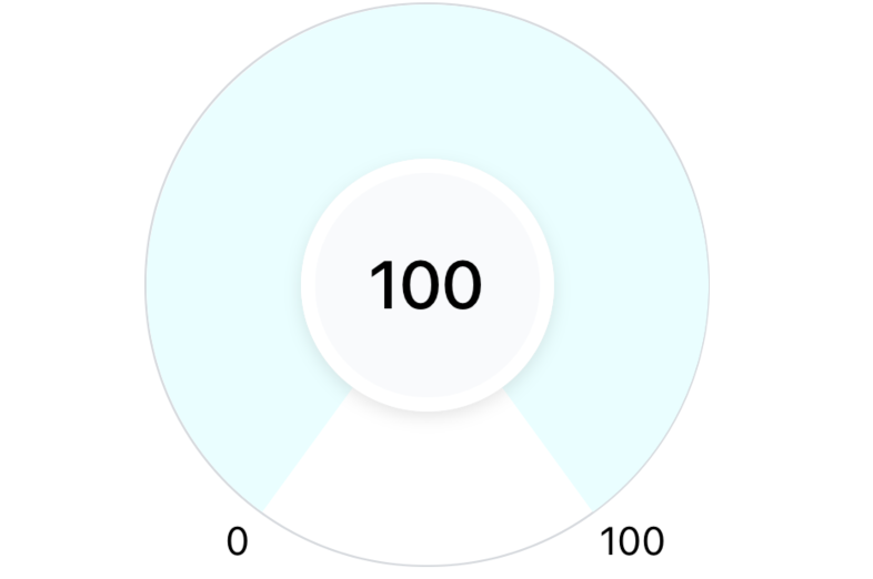
The Arcs - Background Arc
The background arc will act as the base of an indicator which is also the state when the progress will be set to 0. Now to create this background arc using the <Path /> element, we need to calculate the value of the following attributes:
d - set of commands to draw the background arc
stroke - the color of the arc
strokeWidth - width of the arc
Let's create a util that will calculate the d attribute for us:
const getArcData = (params) => {
  const {
    arcStrokeWidth,
    outerCircleWidth,
    arcStartAngleInDeg,
    arcEndAngleInDeg,
  } = params;

  // diameter of the circle = size - strokeWidth
  const arcDiameter = outerCircleWidth - arcStrokeWidth;
  const arcRadius = arcDiameter / 2;

  // x and y coordinated of the center
  const circleCenterX = outerCircleWidth / 2;
  const circleCenterY = outerCircleWidth / 2;

  // convert them to radians for easier calculation
  const arcStartAngle = degreesToRadians(arcStartAngleInDeg);
  const arcEndAngle = degreesToRadians(arcEndAngleInDeg);

  // get start coordinates for the starting point of the arc
  const [arcStartX, arcStartY] = getArcCoordinates({
    angle: arcStartAngle,
    radius: arcRadius,
    circleCenterX: circleCenterX,
    circleCenterY: circleCenterY,
  });

  // get start coordinates for the ending point of the arc
  const [arcEndX, arcEndY] = getArcCoordinates({
    angle: arcEndAngle,
    radius: arcRadius,
    circleCenterX: circleCenterX,
    circleCenterY: circleCenterY,
  });

  /** Create arc using the coordinated calculated above */
  const largeArcFlag = 1; // create the major arc
  const sweepFlag = 1;
  const indicatorArcPath = `M ${arcStartX} ${arcStartY} A ${arcRadius} ${arcRadius} 0 ${largeArcFlag} ${sweepFlag} ${arcEndX} ${arcEndY}`;

  return {
    pathsData: {
      indicatorArcPath,
    },
  };
};
There are a few common constants that we will be using throughout this component, let's also store them in a constants file:
// percentage of the outerCircleWidth we want our stroke width to be
const ARC_STOKE_WIDTH_PERCENTAGE = 0.275;
export const OUTER_CIRCLE_WIDTH = 200;
// distance b/w the outer circle and inner circle
export const ARC_STROKE_WIDTH = OUTER_CIRCLE_WIDTH * ARC_STOKE_WIDTH_PERCENTAGE;

// Start and end arc angles in degree
export const ARC_START_ANGLE = 234;
export const ARC_END_ANGLE = 306;
Here two new constants were added, ARC_START_ANGLE and ARC_END_ANGLE based on how we wanted the shape of our progress indicator arc
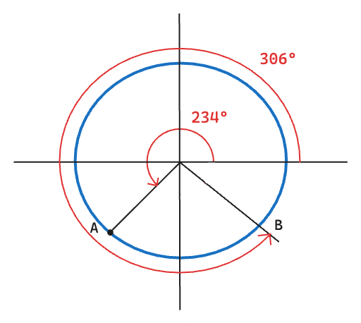
Using these start and end angles, we get a minor arc from points A to B. But what we wanted was the major arc between these points. To get the same we set the largeArcFlag and sweepFlag to 1 in the above util.
Now let's use this util in our component:
const GradientArcProgressIndicator = (props) => {
  const { currentProgress, maxProgress = 100, minProgress = 0 } = props;
  const { pathsData } = getArcData({
    outerCircleWidth,
    arcStrokeWidth: ARC_STROKE_WIDTH,
    arcStartAngleInDeg: ARC_START_ANGLE,
    arcEndAngleInDeg: ARC_END_ANGLE,
  });

  return (
    <View style={styles.container}>
      <Svg style={styles.svgContainer}>
        {/** background arc shown below the animated gradient arc */}
        <Path
          stroke="#e0f2fe"
          fill="none"
          d={pathsData.indicatorArcPath}
          strokeWidth={ARC_STROKE_WIDTH}
        />
      </Svg>

      <View style={styles.centerCircle}>
        <Text>{currentProgress ?? '—'}</Text>
      </View>
    </View>
  );
};
The above code gives the following result:
The Arcs - Border Arc
This arc will be very similar to the previous one with just a few minor changes. Let's add the logic to create the path for this arc in our getArcData util.
const getArcData = (params: GetArcData) => {
  const {
    ...existing params
    borderArcStrokeWidth,
  } = params;

  // diameter of the circle = size - strokeWidth
  const arcDiameter = outerCircleWidth - arcStrokeWidth;
  const arcRadius = arcDiameter / 2;

  // x and y coordinated of the center
  const circleCenterX = outerCircleWidth / 2;
  const circleCenterY = outerCircleWidth / 2;

  // convert them to radians for easier calculation
  const arcStartAngle = degreesToRadians(arcStartAngleInDeg);
  const arcEndAngle = degreesToRadians(arcEndAngleInDeg);

  const distanceFromInnerToOuterArc = outerCircleWidth / 2 - arcRadius;
  const borderArcRadius =
    arcRadius + distanceFromInnerToOuterArc - borderArcStrokeWidth / 2;

  /** broker arcs start and end positions on the x,y plane */
  const [borderArcStartX, borderArcStartY] = getArcCoordinates({
    angle: arcStartAngle,
    radius: borderArcRadius,
    circleCenterX: circleCenterX,
    circleCenterY: circleCenterX,
  });
  const [borderArcEndX, borderArcEndY] = getArcCoordinates({
    angle: arcEndAngle,
    radius: borderArcRadius,
    circleCenterX: circleCenterX,
    circleCenterY: circleCenterX,
  });

  /** Create arc using the coordinated calculated above */
  const largeArcFlag = 1; // create the major arc
  const sweepFlag = 1;
  const borderArcPath = `M ${borderArcStartX} ${borderArcStartY} A ${borderArcRadius} ${borderArcRadius} 0 ${largeArcFlag} ${sweepFlag} ${borderArcEndX} ${borderArcEndY}`;

  return {
    pathsData: {
      borderArcPath,
    },
  };
};
Now let's use the same in our component:
// width of the border arc
const BORDER_ARC_STROKE_WIDTH = 6;

const GradientArcProgressIndicator = (props) => {
  const { currentProgress, maxProgress = 100, minProgress = 0 } = props;
  const { pathsData } = getArcData({
    outerCircleWidth,
    arcStrokeWidth: ARC_STROKE_WIDTH,
    arcStartAngleInDeg: ARC_START_ANGLE,
    arcEndAngleInDeg: ARC_END_ANGLE,
    borderArcStrokeWidth: BORDER_ARC_STROKE_WIDTH,
  });

  return (
    <View style={styles.container}>
      <Svg style={styles.svgContainer}>
        {/** background arc shown below the animated gradient arc */}
        <Path
          stroke="#e0f2fe"
          fill="none"
          d={pathsData.indicatorArcPath}
          strokeWidth={ARC_STROKE_WIDTH}
        />

        {/** border arc */}
        <Path
          stroke="rgba(255,255,255, 0.4)"
          fill="none"
          d={pathsData.borderArcPath}
          strokeWidth={BORDER_ARC_STROKE_WIDTH}
        />
      </Svg>

      // rest of the code
    </View>
  );
};
which gives us the following result (a translucent border arc has been added):
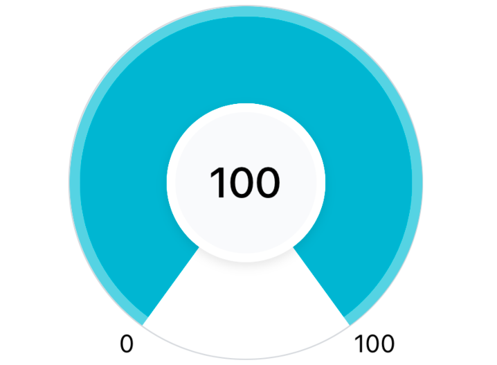
Note: Just to show the translucent border, have changed the background color of the arc in the above image.
The Arcs - Gradient Arc
This arc will be used to indicate the progress of our indicator, which means the length of this arc (circumference) needs to be proportional to the progress. To draw an arc like this, we will be taking the help of two more <Path /> attributes:
<Path
   strokeDashoffset={arcStokeDashOffset}
   strokeDasharray={arcCircumference}
/>
strokeDashArray - used to convert a single stroke into multiple strokes by breaking the single stroke into dashes and gaps.
When there is only a single value passed to this attribute, it creates dashes and gaps of the same length.
For our use case, we don't want any patterns in between our gradient arc so we will set this to be the same as our arc's circumference which will create a single dash of the same size as the arc circumference.
We need to set this as it's a required property to be set before we can use the strokeDashOffset.
strokeDashOffset - used to determine where the dash pattern should start in the path i.e. after what offset should the dash pattern start.
- We can use this to control the length of a single dash we created using the strokeDashArray.
Now let's add the logic to create the Path for this arc in our getArcData util:
const getArcData = (params: GetArcData) => {
  const {
    maxProgress = 100, // new param added
    minProgress = 0, // new param added
    currentProgress = 0, // new param added
    arcStrokeWidth,
    outerCircleWidth,
    arcStartAngleInDeg,
    arcEndAngleInDeg,
    borderArcStrokeWidth,
  } = params;

  // diameter of the circle = size - strokeWidth
  const arcDiameter = outerCircleWidth - arcStrokeWidth;
  const arcRadius = arcDiameter / 2;

  // x and y coordinated of the center
  const circleCenterX = outerCircleWidth / 2;
  const circleCenterY = outerCircleWidth / 2;

  // convert them to radians for easier calculation
  const arcStartAngle = degreesToRadians(arcStartAngleInDeg);
  const arcEndAngle = degreesToRadians(arcEndAngleInDeg);

  // get start coordinates for the starting point of the arc
  const [arcStartX, arcStartY] = getArcCoordinates({
    angle: arcStartAngle,
    radius: arcRadius,
    circleCenterX: circleCenterX,
    circleCenterY: circleCenterY,
  });

  /** Using the same arc path used for the background arc */
  const largeArcFlag = 1; // create the major arc
  const sweepFlag = 1; // drawn arc counterclockwise (positive direction).
  const indicatorArcPath = `M ${arcStartX} ${arcStartY} A ${arcRadius} ${arcRadius} 0 ${largeArcFlag} ${sweepFlag} ${arcEndX} ${arcEndY}`;

  // ---- NEW STEP: CALCULATE arcStokeDashOffset ---- //

  // angle between the start and the end angle
  const arcAngleInDeg = 360 - (arcEndAngleInDeg - arcStartAngleInDeg);
  const arcAngle = degreesToRadians(arcAngleInDeg);

  // get the actual progress values if there is a minProgress available
  // used for measuring progress in the scale of 0 - 100,
  const arcCurrentProgress = currentProgress - minProgress;
  const arcMaxProgress = maxProgress - minProgress;
  const progressCompletedRatio = arcCurrentProgress / arcMaxProgress;
  const remainingProgressRatio = 1 - progressCompletedRatio;

  // length of an arc circle
  const arcCircumference = arcRadius * arcAngle;
  // using remainingScoreRatio to fill arc from right to left
  const arcStokeDashOffset = arcCircumference * remainingProgressRatio;

  return {
    pathsData: {
      bgArcPath,
      indicatorArcPath,
    },
    arcCircumference,
    arcStokeDashOffset,
  };
};
In the above util, the steps to create the gradient arc are the same as the previous arc. The new thing that was added was the calculation of the stroke dash offset:
For this, we first calculated the angle of our arc which is required to get the circumference of our arc as
arcCircumference = arcRadius * arcAngleNext, to calculate the offset, we multiplied the
arcCircumferencewithremainingProgressRatioas offset is after what value the arc should start so we will create the arc in a way that from the end of the arc whatever remaining progress is there, it will get removed i.e. offset will represent the incomplete progress on the indicatorWe also have the sweepFlag set to 1 due to which our arc is drawn counterclockwise (from right to left) which is also what we wanted to take advantage of the offset.
Now we use this util in our component:
const GradientArcProgressIndicator = (props) => {
  const { currentProgress, maxProgress = 100, minProgress = 0 } = props;
  const { pathsData, arcCircumference, arcStokeDashOffset } = getArcData({
    outerCircleWidth,
    arcStrokeWidth: ARC_STROKE_WIDTH,
    arcStartAngleInDeg: ARC_START_ANGLE,
    arcEndAngleInDeg: ARC_END_ANGLE,
    borderArcStrokeWidth: BORDER_ARC_STROKE_WIDTH,
    maxProgress,
    minProgress,
    currentProgress,
  });

  return (
    <View style={styles.container}>
      <Svg style={styles.svgContainer}>
        {/** background arc shown below the animated gradient arc */}
        <Path
          stroke="#ecfeff"
          fill="none"
          d={pathsData.indicatorArcPath}
          strokeWidth={ARC_STROKE_WIDTH}
        />

        {/** animated gradient path */}
        <Path
          stroke="#06b6d4"
          fill="none"
          d={pathsData.indicatorArcPath}
          strokeWidth={ARC_STROKE_WIDTH}
          strokeDashoffset={arcStokeDashOffset}
          strokeDasharray={arcCircumference}
        />

        {/** border arc */}
        <Path
          stroke="rgba(255,255,255, 0.4)"
          fill="none"
          d={pathsData.borderArcPath}
          strokeWidth={BORDER_ARC_STROKE_WIDTH}
        />
      </Svg>

      // rest of the code
    </View>
  );
};
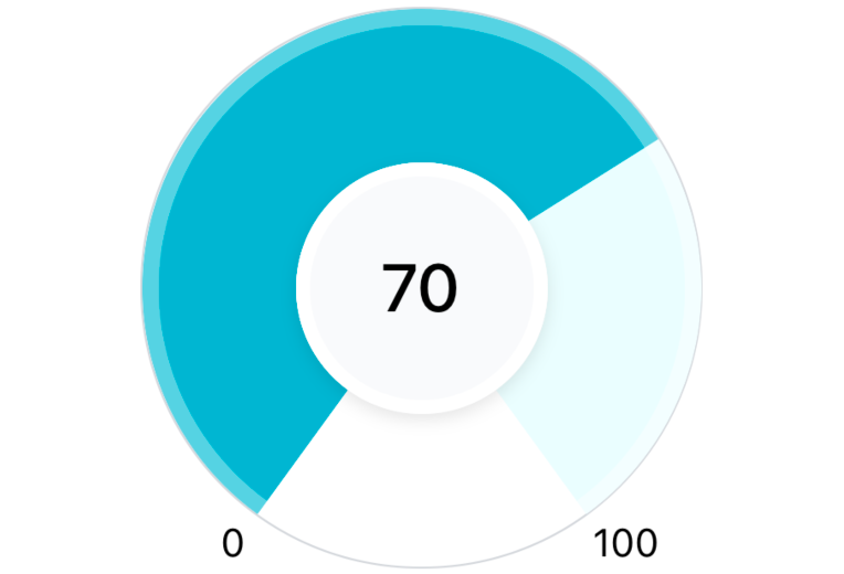
Which will create the following (Note: to display the above, the currentProgress the prop was set to 70):
Now to add the gradient effect, we will use the <LinearGradient /> and other related elements from the react-native-svg package.
{/** animated gradient path */}
<Defs>
   <LinearGradient id="grad" x1="0" y1="0" x2="100%" y2="0">
     <Stop offset="0%" stopColor="#ecfeff" />
     <Stop offset="100%" stopColor="#06b6d4" />
   </LinearGradient>
</Defs>

<Path
   stroke="url(#grad)"
   fill="none"
   d={pathsData.gradientArcPath}
   strokeWidth={ARC_STROKE_WIDTH}
   strokeDashoffset={arcStokeDashOffset}
   strokeDasharray={arcCircumference}
/>
which gives us an arc where we can see the gradient going from left to right. Unfortunately, conical gradients are unavailable in SVG but this is a good trick to create a similar effect.
The Arcs - Improving the gradient
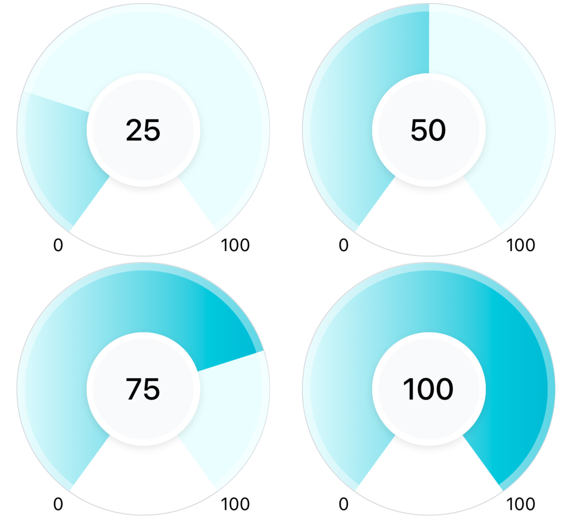
In the previous images, look at the color at the end of the gradient when the progress is 25% vs when it's 100%. You will notice the gradient is more prominent (able to see all colors from the lightest to the darkest shade of the gradient) for the latter case.
This happens because we are using a linear gradient that goes from left to right. So the further the gradient goes towards the right side, the more colors we will see in the gradient. We can easily improve this by tweaking a few values of the LinearGradient element.
For less than 50% progress we can change the direction of the gradient to be from bottom to top so that the gradient will now become vertical. This will make the gradient in the range 0 to 50 more prominent.
For above 50 our current implementation works fine as the gradient goes from left to right (horizontal) and that's where most of our arc is.

 // Gradient X1 and X2 values to make it more prominent
 const midProgressValue = (maxProgress - minProgress) / 2 + minProgress;
 const gradientY1 = currentProgress <= midProgressValue ? '100%' : '0';
 const gradientX2 = currentProgress <= midProgressValue ? '0' : '100%';

 <Defs>
   <LinearGradient
     id="grad"
     x1="0"
     y1={gradientY1}
     x2={gradientX2}
     y2="0"
   >
     <Stop offset="0%" stopColor="#ecfeff" />
     <Stop offset="100%" stopColor="#06b6d4" />
   </LinearGradient>
 </Defs>
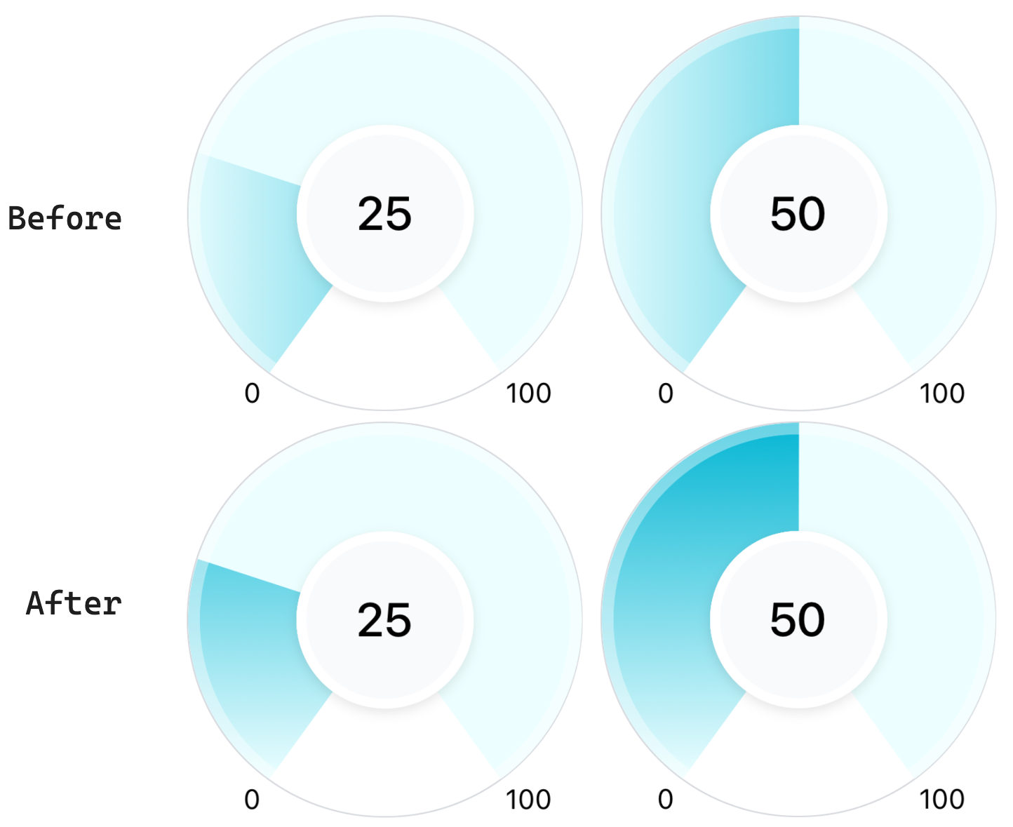
After making the above changes this is how the indicator looks like:
The Needle
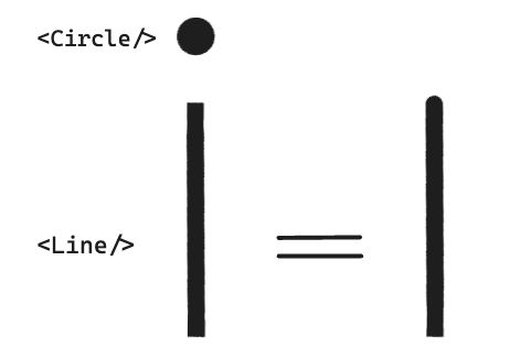
Now we will create a needle for our indicator which will point to currentProgress of the user. To create this in SVG we will be taking the help of the following SVG elements:
<Line />- will be used to create a straight line which will be the main needle<Circle />- will be used on the top of the needle to give a rounded border effect<G />- Know as the group element which we will use to group the line and the circle element. This will be useful when we would want to apply the same changes to both elements (like rotating them).
Other than the above SVG elements we will need to calculate the following data:
Needle starting (x1,y1) and end position (x2,y2) on the SVG plane - This will be the needle's initial position on the indicator from where the gradient starts to fill.
needleRotationAngle - From the initial position, how much do we need to rotate the needle to match the position of current progress on the indicator
Let's add the calculations for the above data to our getArcData util:
const getArcData = (params: GetArcData) => {
  const {
    maxProgress = 100,
    minProgress = 0,
    currentProgress = 0,
    arcStrokeWidth,
    outerCircleWidth,
    arcStartAngleInDeg,
    ...other params
  } = params;

  // diameter of the circle = size - strokeWidth
  const arcDiameter = outerCircleWidth - arcStrokeWidth;
  const arcRadius = arcDiameter / 2;

  // x and y coordinated of the center
  const circleCenterX = outerCircleWidth / 2;
  const circleCenterY = outerCircleWidth / 2;

  // convert them to radians for easier calculation
  const arcStartAngle = degreesToRadians(arcStartAngleInDeg);

  const arcCurrentProgress = currentProgress - minProgress;
  const arcMaxProgress = maxProgress - minProgress;
  const progressCompletedRatio = arcCurrentProgress / arcMaxProgress;

  // ---- Needle related data ---- //
  // from arcAngleInDeg, how much angle has been completed
  const needleRotationAngle = arcAngleInDeg * progressCompletedRatio;

  // needle starting position for its end points (x2,y2),
  const [needleInitialEndX, needleInitialEndY] = getArcCoordinates({
    angle: arcStartAngle,
    radius: arcRadius,
    // set to 0 as we will be handling this in the svg group
    // (moving both the line and circle to the center)
    circleCenterX: 0,
    circleCenterY: 0,
  });

  return {
    needleData: {
      initialX2: needleInitialEndX,
      initialY2: needleInitialEndY,
      rotationAngle: needleRotationAngle,
    },
    circleCenterX,
    circleCenterY,
  };
};
and now using this util in our component:
const NEEDLE_STROKE_WIDTH = 5;
const NEEDLE_TOP_CIRCLE_WIDTH = 2.4;

const GradientArcProgressIndicator = () => {
  const { currentProgress, maxProgress = 100, minProgress = 0 } = props;
  const {
    ...,
    needleData,
    circleCenterX,
    circleCenterY,
  } = getArcData({
    outerCircleWidth,
    arcStrokeWidth: ARC_STROKE_WIDTH,
    arcStartAngleInDeg: ARC_START_ANGLE,
    arcEndAngleInDeg: ARC_END_ANGLE,
    borderArcStrokeWidth: BORDER_ARC_STROKE_WIDTH,
    maxProgress,
    minProgress,
    currentProgress,
  });

  return (
    <View style={styles.container}>
      <Svg style={styles.svgContainer}>
       // ... rest of the code

        {/** border arc */}
        <Path
          stroke="rgba(255,255,255, 0.4)"
          fill="none"
          d={pathsData.borderArcPath}
          strokeWidth={BORDER_ARC_STROKE_WIDTH}
        />

       {/** needle */}
        <G
          x={circleCenterX}
          y={circleCenterY}
          rotation={needleData.rotationAngle}
        >
          <Line
            x1={0}
            y1={0}
            x2={needleData.initialX2}
            y2={needleData.initialY2}
            stroke="#164e63"
            strokeWidth={NEEDLE_STROKE_WIDTH}
          />
          <Circle
            fill="#164e63"
            r={NEEDLE_TOP_CIRCLE_WIDTH}
            cx={needleData.initialX2}
            cy={needleData.initialY2}
          />
        </G>
      </Svg>

       // ... rest of the code
    </View>
  );
};
In the above code, we have:
Placed the circle at the end of the needle by setting
cxandcythe same as the endpoint of the needle which gives us a rounded border effectMoved the whole group (circle + line) to
circleCenterXandcircleCenterXwhich brings the needle's starting position to the center of the circle.Then we set the rotation property on the group to rotate the whole needle according to the user's progress.
which gives us the following output:
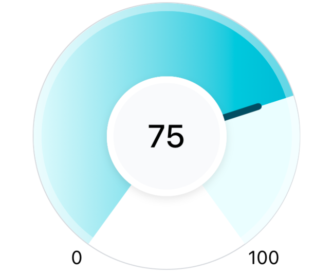
Continued in the next part
We have a nice-looking progress indicator component ready. In the next part, we'll add some final touches and animations to bring it to life.
Head over to the next part: